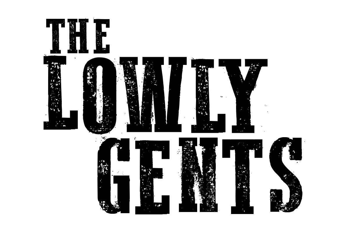
Final Logo
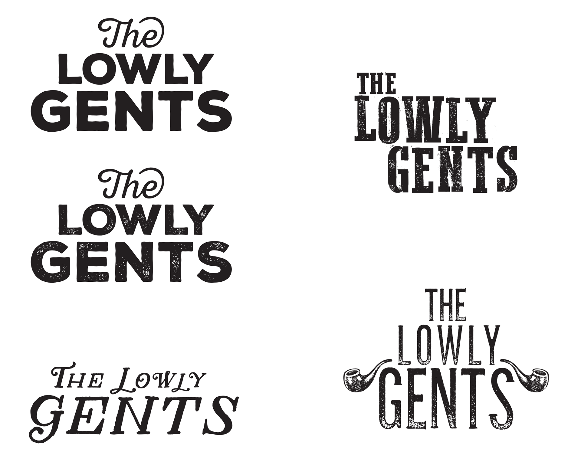
Presented Logos
Local Edmonton band The Lowly Gents were looking for a new logo to capture the look and feel of their band. They were open to my expertise and I felt that a strong wordmark made the most sense for them. After careful consideration I presented 5 concepts for them to review. Ultimately, they choose a distressed American woodtype style font that was positioned slightly askew to mimic a stamped-style letter block. Given the nature of the bands alt-rock musical style it felt just right.
Final Logo
Presented Logos